News Article Template Redesign
Project
The news article template page is the workhorse of the American Medical Association's website since 80% of pages on the site are based on this template type. Visitors to the site, of which 65-75% arrive by organic search, land on these pages between 80-90% of the time. Therefore on-page engagement is crucial in assisting users to dive deeper into the site, increasing site visit time and decreasing bounce rates.
Challenge
From the business perspective, the main goal of the AMA website is to convert users, specifically doctors, into members of the AMA and/or drive membership renewal. The news article pages are a great tool for conversion as doctors are looking to the AMA as a resource for up-to-date news on a particular subject as well as researching governing policies overseen by the association's Board of Trustees and House of Delegates.
The AMA's priority was straightforward: grow and retain membership. Design, on its own terms, was never really valued. The homepage had been built reactively — whatever needed to hit that quarter or year — with no cohesive hierarchy holding it together. Too many stakeholders had a say, and not all of them were willing to work within UX best practices.
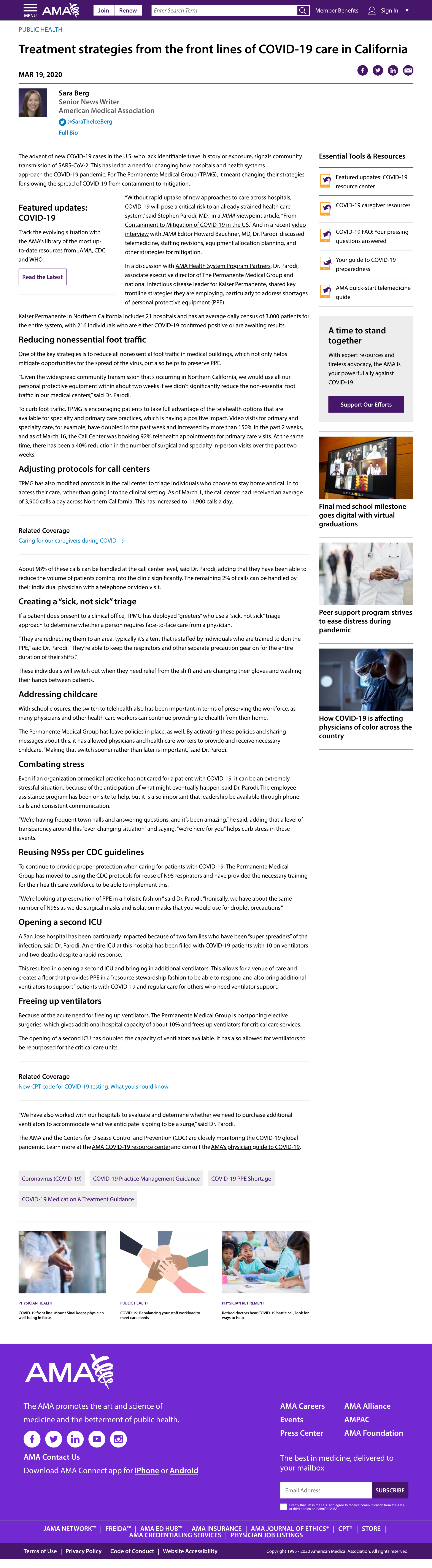
The original News Article template before redesign. (Click for a closer look.)
This work was originally scheduled for Q4 2020. COVID moved it up to Q2. As the pandemic hit, our site's monthly traffic jumped from roughly 350K to 1MM visitors, and we were reporting on COVID daily — the redesign wasn't optional anymore. We needed the template to help readers dive deeper into that coverage right when they needed it most, not six months later.
Working Within Constraints
Two structural issues made this harder than a typical redesign. First, our sprint cycles ran a full month — a cadence I never fully understood the reasoning behind, but one that slowed implementation at every turn. Second, we were building inside a CMS with very little flexibility, which meant even a straightforward layout change had to be negotiated against what the platform could actually support.
The Research
The American Medical Association's vision for the website is to become more editorial driven, informing users who can be visitors or members who are strictly doctors. I initially researched leaders in print media who had a strong presence on the internet. The New York Times, The Guardian, Los Angeles Times and Financial Times became the places where I spent the most of my research time. What we found was strong page hierarchy which assisted us in our decisions when redesigning the template.
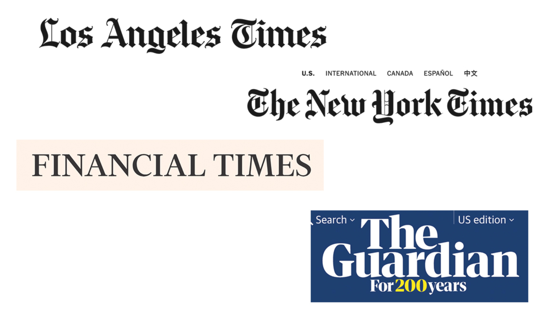
Alongside the editorial giants, I also looked at organizations in the AMA's own milieu — AARP, the National Bar Association, and the National Society of Pathologists — since membership-driven associations face a different storytelling challenge than a newsroom does. Those sites became a real north star for what "good" could look like within our specific constraints.
Three Users, Zero Access — and What I Did Instead
The AMA's site actually served three distinct groups: the general public, hospital and insurance staff who relied on the site for CPT code updates — genuinely the organization's bread and butter — and doctors themselves. All three were difficult to reach for direct, one-on-one research.
Without that access, a lot of real decisions got made blindly. No one at the table was working from UX best practices, design decisions were made by committee, and we leaned on A/B testing as the substitute for research we couldn't otherwise get.
What I could do was work the access I did have. I interviewed internal Subject Matter Experts from both the Content Operations Team and the Editorial Team to understand pain points within the current layout — not a replacement for end-user research, but real signal where none of the actual end users were reachable.
Each of these meetings was level-set with the understanding that the current state wasn't the best user experience, and we'd review the current page together to discuss solutions. What we came away with was a clear, concrete direction that carried straight into wireframing.

What Was Actually Broken
From my UX knowledge, I knew right away what the main issue was with the News Article page and why users weren't diving deeper into the site.
• Essential Tools & Resources lived in the right gutter panel and were lost once a reader started reading the article — entirely out of the viewer's frame.
• Related Content sat in that same right panel, with the same problem — out of sight by the time anyone reached the bottom of the article.
• Floating at the bottom of the page were topic buttons — Physician Burnout, Practice Transformation, and others — with no title or context explaining what they were.
• Below that sat three images with section titles and an article title, with no visible connection to the story the reader had just finished.
There was real content on the page. The problem was that none of it connected to the story the reader had actually just read.
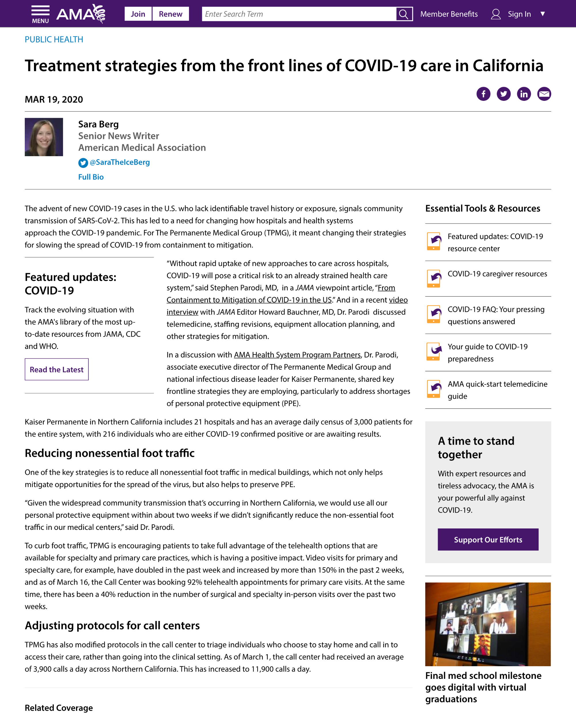
The top of the existing page, where the right-rail modules disappeared from view once a reader started scrolling. (Click for a closer look.)
Process: Sketch to Wireframe
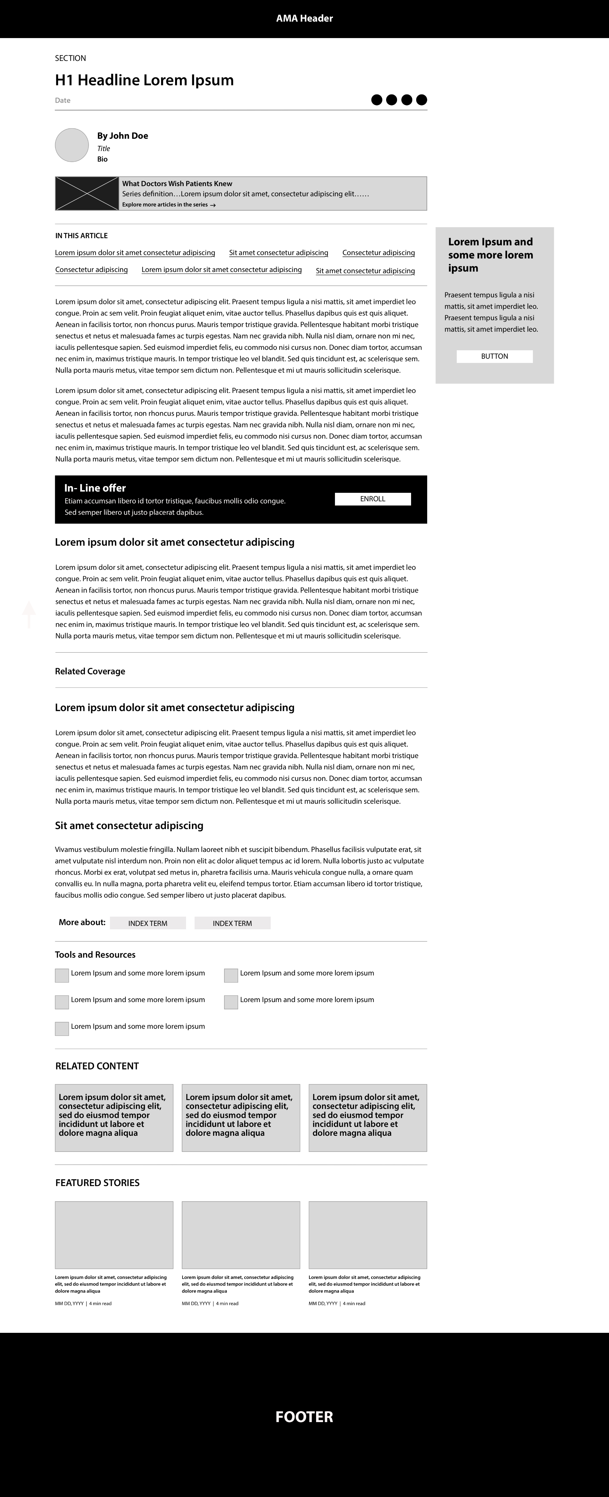
My understanding of why we weren't seeing better User Engagement, Page Depth (pageviews per session), or a lower Bounce Rate shaped every decision from here. The sketch and wireframe below were both built against those three metrics specifically, not just a visual preference.
Sketch
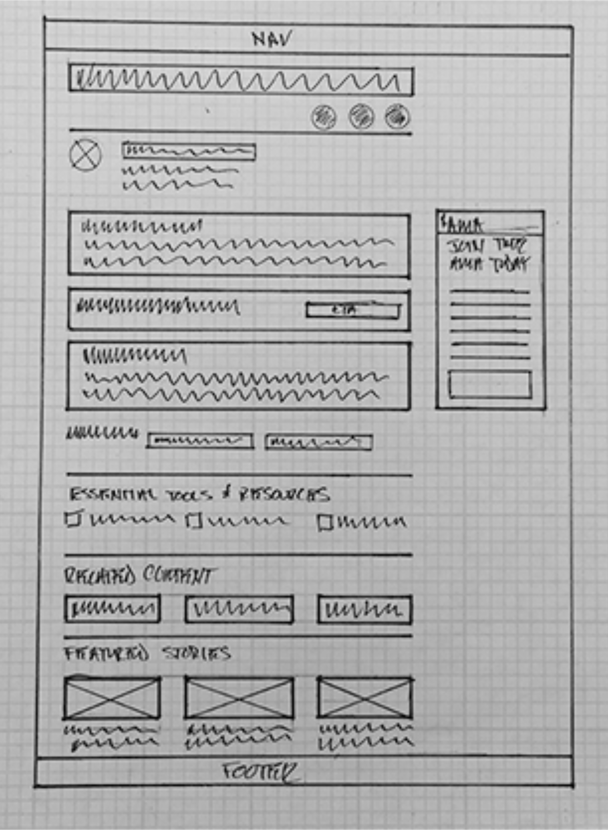
Wireframe
Visual Design
I understood the bottom of the article was crucial space where we could leverage deeper user engagement and lessen the bounce rate.
Here is what I did:
1. The first addition was a ruled-off section titled Related Coverage. It gave one link to an article within the parameters of what the user just read.
2. I created a More About section with pill buttons leading to a wider set of topics the article was affiliated with in terms of narrative.
3. I incorporated a container titled Essential Tools & Resources with links to more hyper-focused areas. In this case, it was COVID-19, with links to featured updates on the pandemic as well as resources for caregivers.
4. I decided we needed more context than the current News Article page had with its related content at the bottom. I created a flag stating "Related Content" and ruled off the three articles slotted in the row below.
5. As a team, we collaborated on the last engagement piece, based on the thought: what if a user doesn't want to dive deeper into the subject — in this case, COVID-19 — but wants to go to other articles from the main page without hitting the back button? We created the "Featured Stories" section, with the lead story and most-trafficked stories within this ruled-off container.
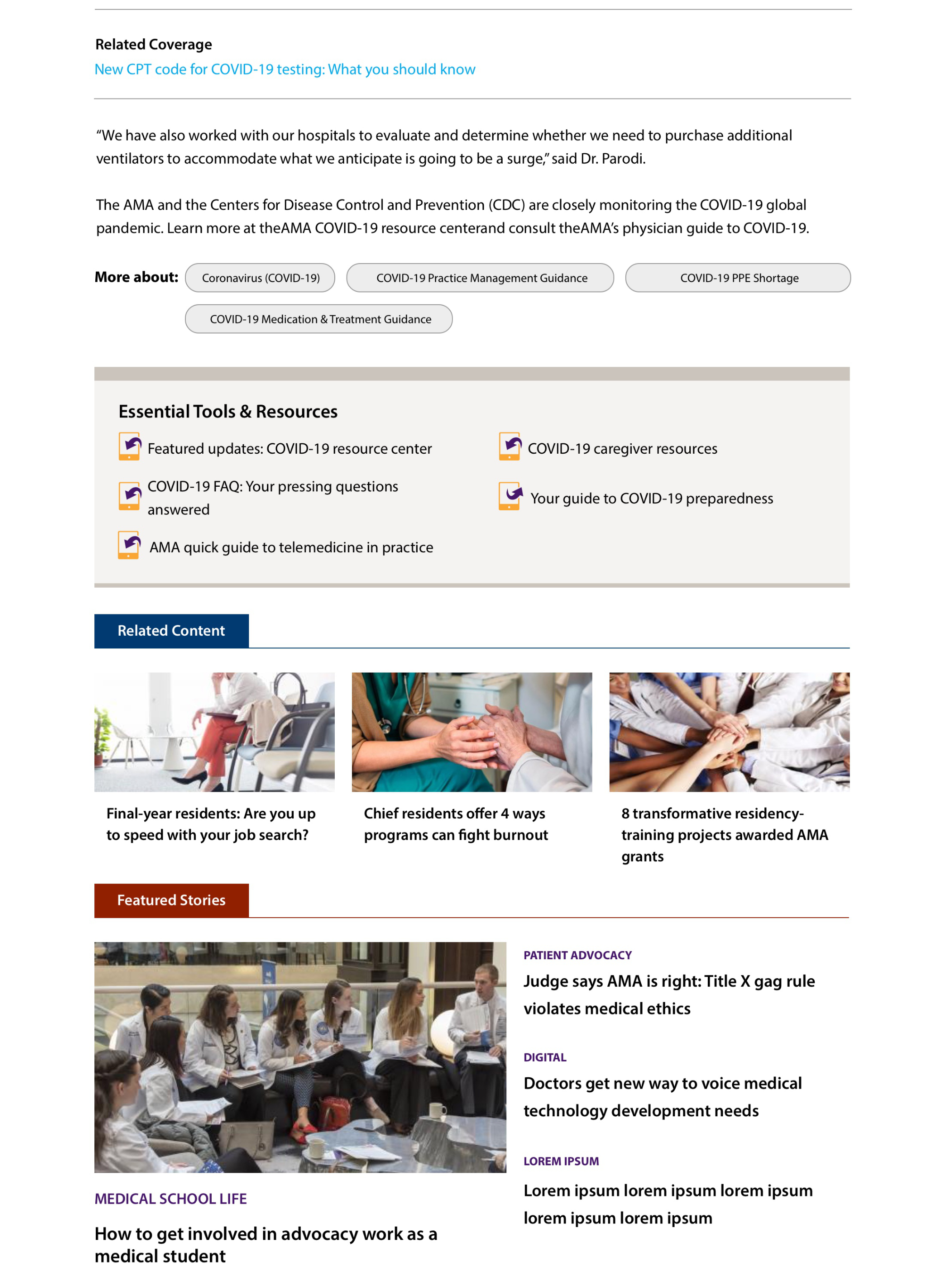
The bottom of the redesigned page, cropped to focus on exactly what changed. (Click for a closer look.)
Outcome
This work improved on-page engagement by 10–13% and increased membership exposure by restructuring article layouts to better align with user reading behavior.
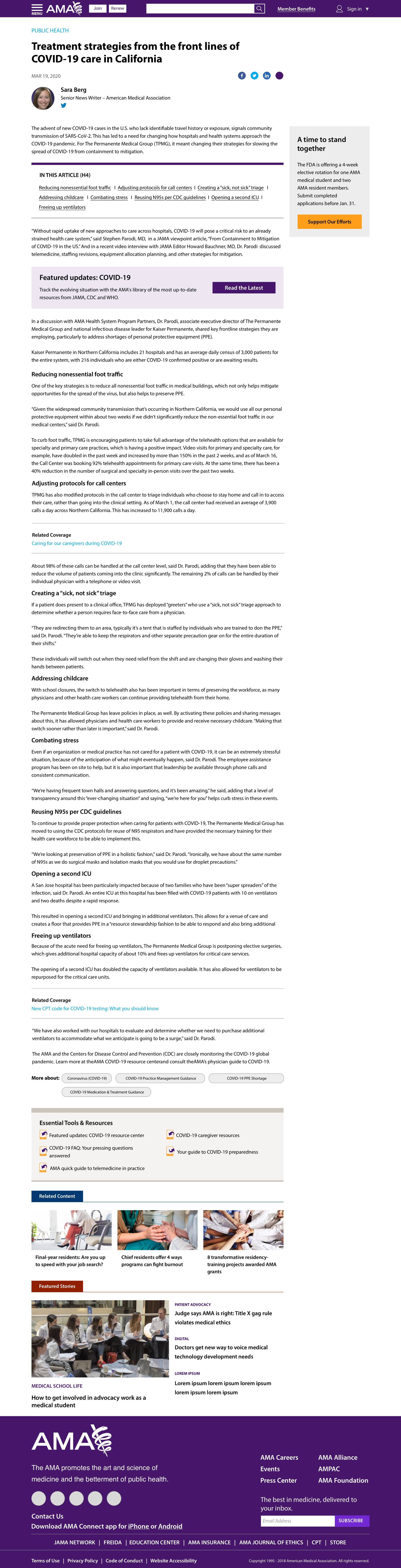
The redesigned News Article template, shipped. (Click for a closer look.)
Conclusion
In most instances, a UX designer would A/B test a product update or redesign. However, we did not have that flexibility due to the fact that we knew the page needed an overhaul and Google Analytics gave us insight that the Essential Tools & Resources module was only garnering 10% click through and Related Content was not much more at 15%. Featured stories were holding their own at 20% and we estimated the reason why was that the content lined up with the end of shorter stories as well as being driven by an image.
Once we implemented the design change, we waited a full month before running Google Analytics. The results from Google cemented our vision with updating the News Article template by revealing upticks in click-through rates by 10 to 13% in each of the modules we created. Plus, with addition of membership merchandising on the page, we noticed a baseline of 5% traffic through those blocks.
This project shipped in July 2020 — compressed from its original Q4 2020 timeline once COVID hit and visitor traffic surged from roughly 350K to 1MM. That urgency shows up in the annual numbers too: 2019 traffic of 11MM roughly doubled to 22MM in 2020. The team felt strongly that the updated template helped readers actually use that surge in traffic to go deeper into our coverage, rather than just absorb it.
Beyond this one redesign, the broader pattern at AMA was that we A/B tested everything. But the designs put into those tests weren't run through me — management decided on a direction and tested it themselves, then came back with results already baked in. That's a different kind of speed bump than a stakeholder pushing back on a specific choice: it's operating inside a process where the design decision-making happened somewhere else entirely, and my job was to make sense of what came back.
Learnings & Reflection
This project taught me how to make confident decisions without the safety net of A/B testing. Normally I'd want to validate a redesign against a live variant before committing to it fully. A global health crisis compressing our timeline from Q4 to Q2 meant we didn't have that luxury — we had to trust the qualitative signal (SME interviews, competitive research, the analytics on what was actually failing) and be ready to measure hard and fast once it shipped, rather than test-and-adjust along the way.
It also reinforced how much weight a single template can carry: this page structure touches roughly 80% of the AMA's site, so a change here was never a one-off decision — it was systemic. That scale is part of why we leaned so heavily on competitive research from outlets like The New York Times and The Guardian before committing. At that reach, we needed real conviction, not just confidence, before touching something used that broadly.
Portfolio



-
American Medical Association
News Article Page Redesign -
Bristol-Myers Squibb
Crohn's Disease Clinical Trial Site -
Procter & Gamble
USOC Partnership